Equalista’s onboarding course
The opportunity
The team behind a bootstrap education app (Equalista) were on a mission to educate users about gender inequality, via bite-sized courses.
The interface copy and course content was written by passionate academics. But not tested with users.
They reached out for content design help.
Scope the work
I paired with a friend and UX writer (because two brains 🧠 are better than one!) to work with the client to define their content needs into chunkable slices.
It was pro bono work and we were working across time zones. We wanted to set clear expectations.
The sliced-up briefs
Brief 1: User-test the intro course to propose a revised flow.
Brief 2: Review the home screen and propose content revisions.
Brief 3: Review glossary push notification.
Brief 4: Prototype and test new paywall copy.
Spotlight on brief 1
Brief 1: User-test the intro course to propose a revised flow.
(We’ll focus on Brief 1 for now).
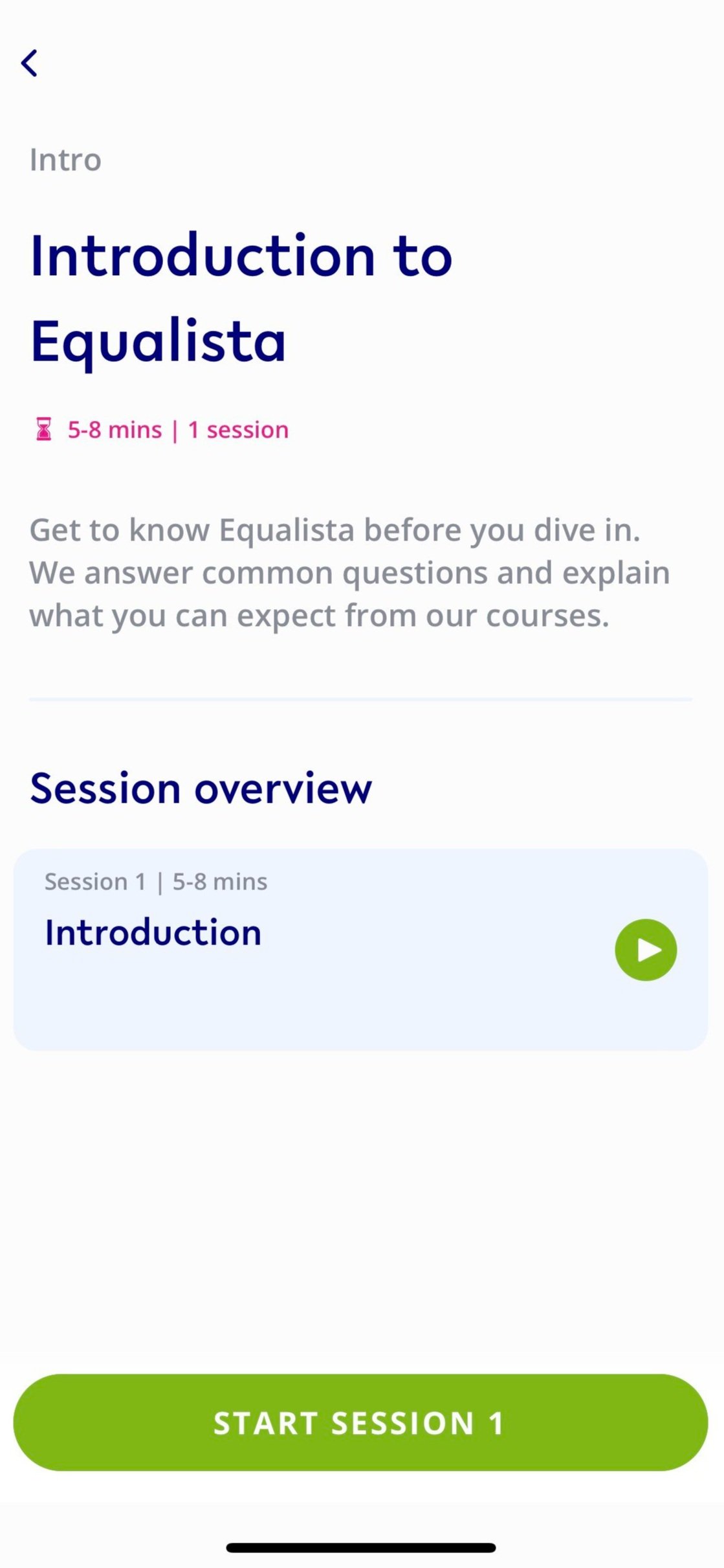
A compulsory intro course that users must complete to unlock future (paid) content.
The client wanted it to give users the basics. As well as explain why they asked users to pay.
It needed to engage enough for users to finish it. And leave them wanting to try the next session.
It was 64 screens in total.
Talk to (target) users
🍋 Work with what you’ve got
The client was unable to access analytics on completion stats or behaviour from early sign-ups to help us understand drop-off behaviour. So we made the call to run user tests to inform content revisions. The client was also hesitant to contact subscribers, so we recruited test users who fit their user personas. In an ideal world, we’d use the data.
We pulled together testing goals and a discussion guide for some user research (1:1 user interviews and a moderated card sort/ranking activity).
We wanted to know:
How did users feel during the course? What sparked joy, felt new, or important?
What were their key takeaways? Did they match what the client wanted users to walk away with?
Did users feel motivated to try another course?
Our client also wanted to know:
Is there too much information? Is the course too long?
Did users recall the key concept of ‘intersectionality’?
Would they be motivated to learn more? Why, why not?
Do they understand why we ask them to pay? How do they feel about it?

User testing plan.
Card sort (of sorts)
We took the 64 screens and summarised them into 16 key messages* (with a client OK of course).
We ran a moderated activity in Miro, and asked users to assign each message to one of four buckets — talking out loud about their reasoning.
Users took the key messages and assigned them to 1 of 4 buckets
I need to know this is the intro course (keep it).
I don’t need to know this in the intro course (but it’s important, so tell me some other way).
I don’t need to know this (at all).
Undecided.
*This was pre ChatGPT. I’d love to see if that would speed this up.

A moderated card sort (of sorts) to understand users’ take on the content.
Deliver
We took user feedback and proposed a revised (user-informed) onboarding course that reduced the number of screens from 64 to 15 screens.
That’s 24% fewer clicks for the user. While ensuring the user is left with the key takeaways desired by the client (nice!).
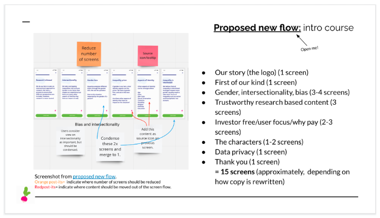
Recommended new flow for the client.
Result

Less screens for the user to move through, but still the educational takeaways. (FYI - The app featured a radish icon.)
The client took the recommendations, but work unfortunately paused.
To measure impact, I would look for:
📈 Increased course completion rate by new users.
📈 Increase in the number of new users starting the next course.
For ongoing improvements, I would:
📈 Explore efforts to capture user behaviour to understand drop-off points. A quicker more sustainable approach to future changes.
📈 Explore ways to capture feedback from new users who drop out before completing the intro course.