Verification Flow
Problem
While reviewing a new analytics dashboard, I identified that 48% of users entering our MVP business verification flow were not completing it. 🤔
Discovery
I used Google Analytics data and user flows to map two key drop-off points:
Proof of identity (POI) check: 48% of users who select ‘verify status’ (CTA) dropped out when asked for proof of identity.
Name matching API check: A further 35% of users, after providing proof of identity documents, fail the name-matching API check (external data check).
I presented the flow and data to my squad, requesting I focus on it in my next sprint.
We didn’t have benchmarking data, but I wanted to know if our drop-off was higher than other products. So I requested data on similar proof of identity checks in other product integrations.
🙁 We learned that our drop-off was higher than the benchmark. By approximately 23%. Not great.
Hypothesis
I hypothesised that the current entrance screen had some gaps.
Expectation not set
It didn’t prime users to know they’d need to produce two forms of ID to complete the flow.
Targeting is not targeted enough.
Our existing API allowed the team to target the content to eligible businesses, but couldn’t ensure the message was seen only by eligible users.
I asked an engineer to look into users who was failing our name match. He found that 66% of our total name-matching fails were ineligible users. In short, we were wasting their time.

I mapped the drop-offs in the user flow using Miro, to help discussion with my squad.
(Image not intended to be readable).
Ideate
I brainstormed some ideas and pitched my preferred content solutions to the team:
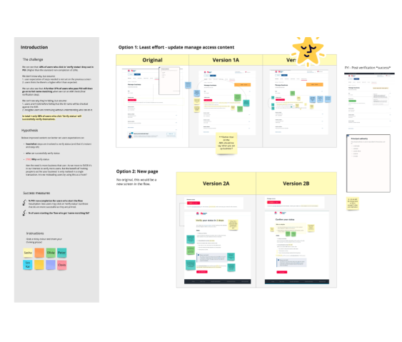
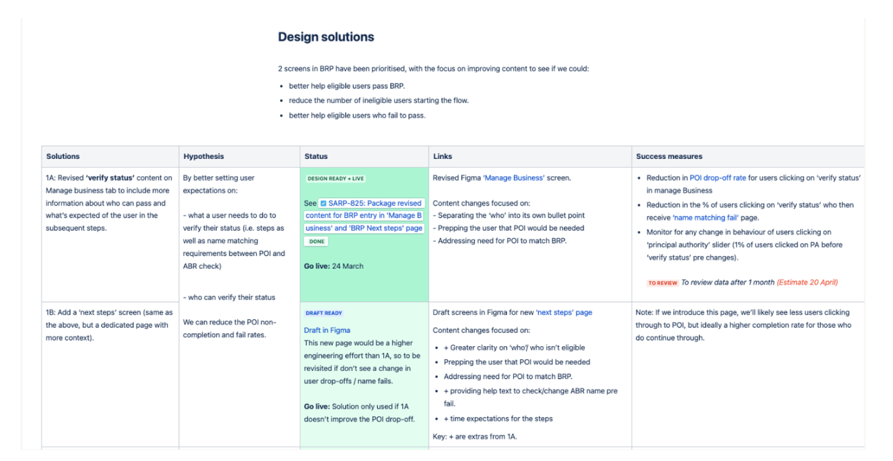
Solution 1: Revise the supporting line on the entrance screen.
Solution 2: Add an instructional screen to set expectations and prep users to avoid common errors.

Decision: We agreed that solution 1 would be the quickest to implement, require the least developer time, and allow us to test quickly.
Pros and cons brainstorm for possible solutions [Not intended to be readible]. .
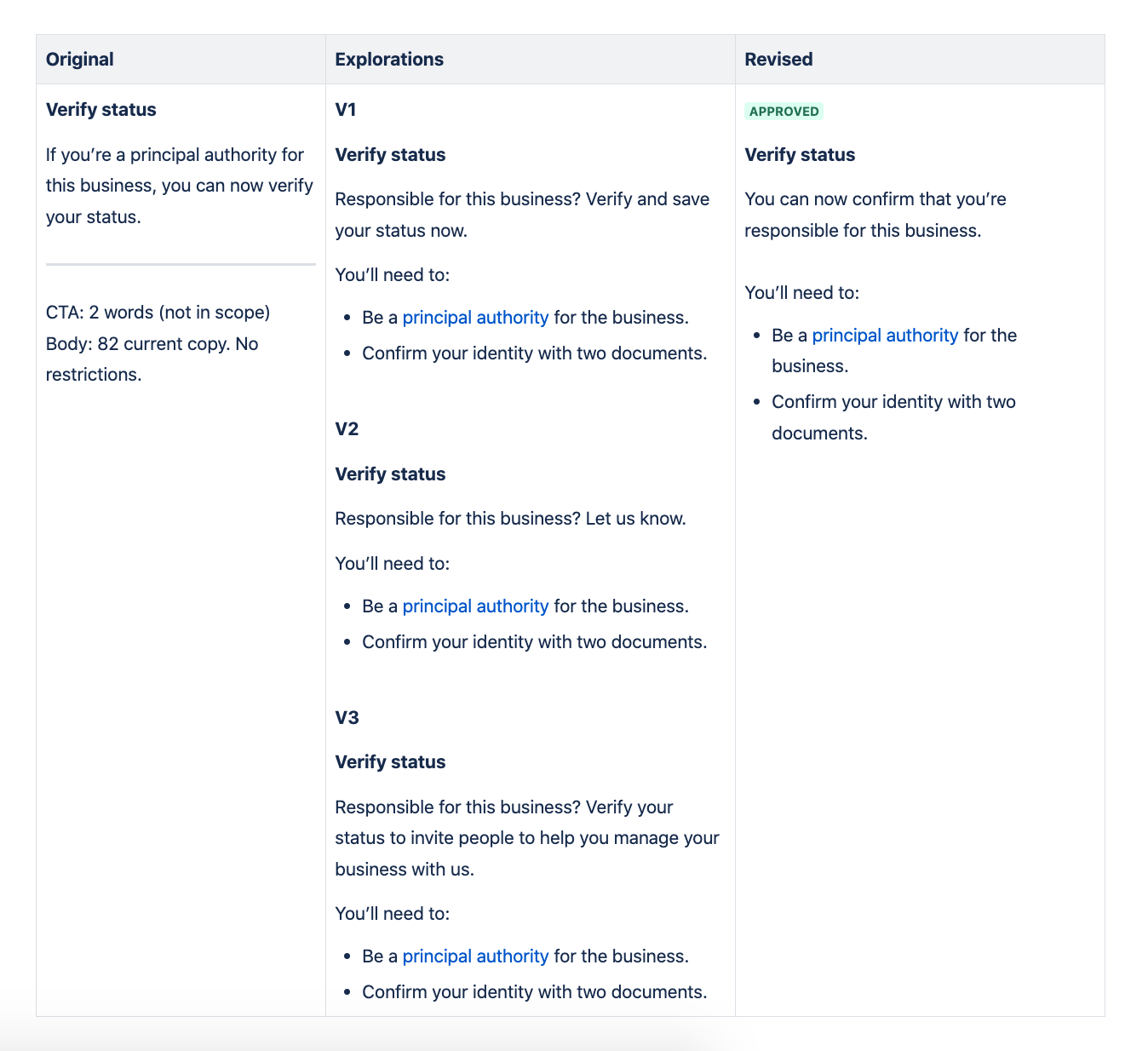
I drafted content variations for feedback from the squad, sourcing patterns from similar products, internally and externally.
I brought my top variations to content crit to get feedback and check for existing patterns I may have missed in my discovery. They lent their brains to check clarity and consistency.
Knowing I wouldn’t get a chance to test the copy, I ran the options past two frontline staff. They helped our customers daily, so I felt they were a good secondary source to weigh in.
I updated the Figma files for the engineers to work their magic.
Design and iterate
Content versions brought into content crit.
💡 I started sparring with frontline staff after working alongside them at a contextual enquiry field trip (to build digital flood grant applications). I saw firsthand how nuanced their knowledge was about customers and their know-how on words customers use. I would later lead a project team to set up and train a pilot panel of frontline staff to help designers with rapid prototype testing and discovery.
Content thinking
Set expectations: Tell the user they need to confirm their identity with two forms of ID. It’s no ‘one-click-and-you’re-done’ kind of check.
Be clearer on who’s eligible: Past user testing showed that the official term ‘principal authority’ wasn’t known among many business users. I added the supporting line ‘someone responsible for this business’ to help (in the same round of testing this line had helped users decide if it was for them).
We also linked the term ‘principal authority’ to an existing slider with a list of known roles to users (e.g. ‘a principal authority is usually a director, an owner, a trustee…’). The component already existed elsewhere in the product, so should support users here. Especially given it was an entry path and the first time many users saw the term.
Encourage action: Spotlight the new with ‘you can now’.
Copy explorations.
Error messages
In the same sprint, I reviewed, paired and scheduled revised error message content to better help users who didn’t pass the name-matching API (the second drop-off point). I’ve not included them here. Happy to chat to them in person.
Result
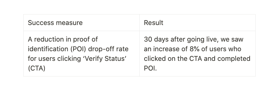
In its first 30 days of the change going live, the team saw:
8% uplift: Users who clicked on the CTA and completed proof of identity (POI) check.
6% uplift: Users passing the second name-matching API check.
Next up
Knowing I would rotate out of the squad, I documented the work for the team to monitor, packaging copy variations and recommendations.
The ‘what’s in it for me’?
One thing that I felt was missing from copy was the user benefit. By verifying their status, users would unlock the benefit of inviting people to act for their business (using our Relationship authorisation manager, or RAM, an even newer integration). At the time of review, however, RAM was still in its infancy and integrated too few transactions. We didn’t want to mislead users, so I recommended we revisit this value-add later in the year.
The CTA needs testing.
Variations of the CTA were not content-tested with users. I would recommend testing the CTA, and some alternatives, to understand user understanding of ‘verify status’.